
Efsy
view the site01Category
Brand
02Date
2025
03Place
Prague
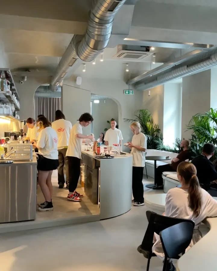
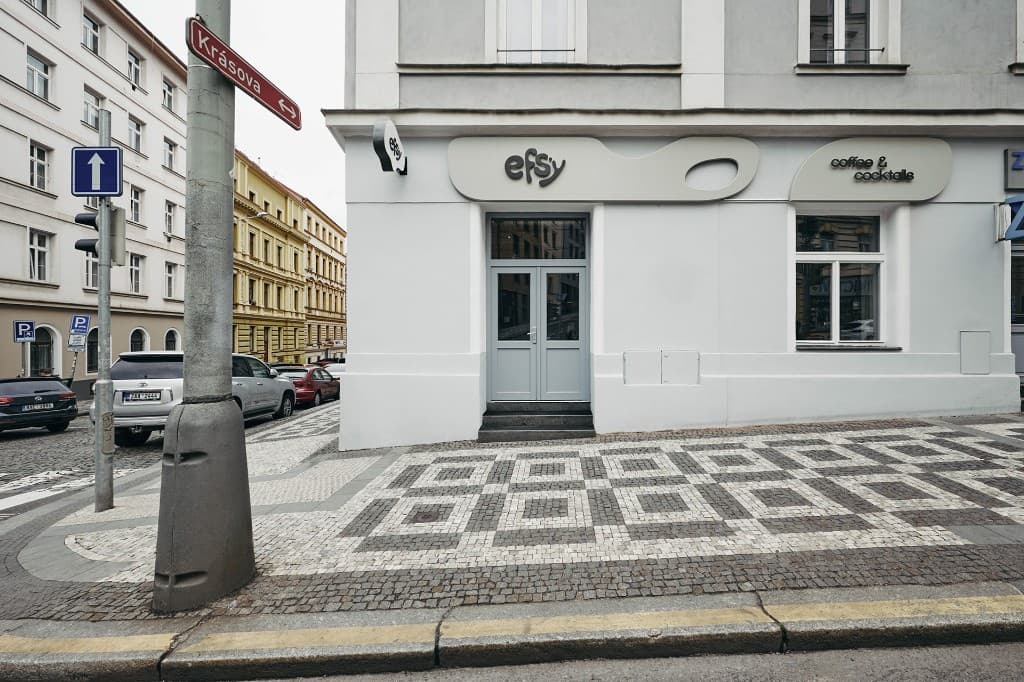
Efsy - a Žižkov café by day and a cave-like bar after dark. I led the logo, menus, posters, Instagram, the guest app, and graphics for events.
Goal - one language for Fresh AM and Sexy PM. Cups, menus, the feed, and a private night had to feel like the same place, not two brands sharing an address.
I designed the wordmark system, printed and digital menus, posters, Instagram covers, the loyalty app, and event dressing.
Logo
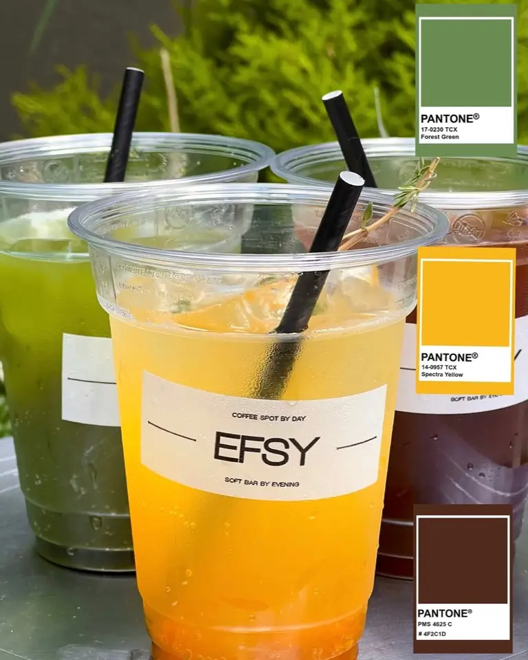
A fluid wordmark that still reads from a cup, a tee, and a 12-pixel favicon. Red on cream for day, light on dark for the cave.
I built the mark into a small system: labels, staff shirts, and a Pantone set that can move from matcha green to evening brown without looking like a new brand.
Menu
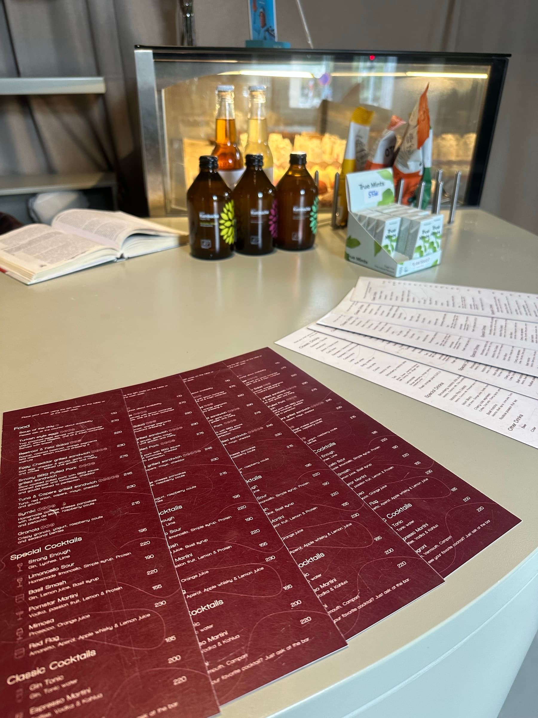
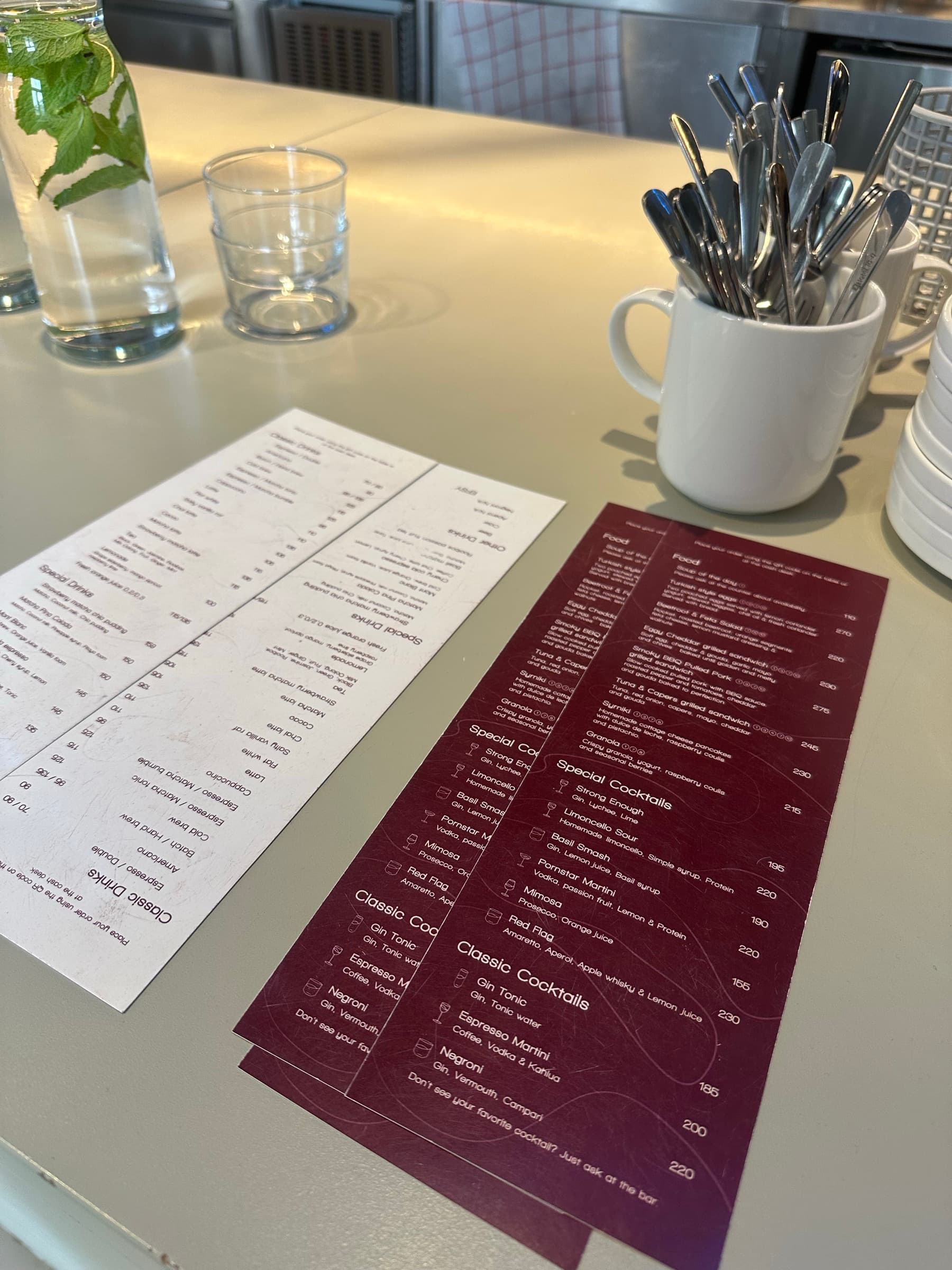
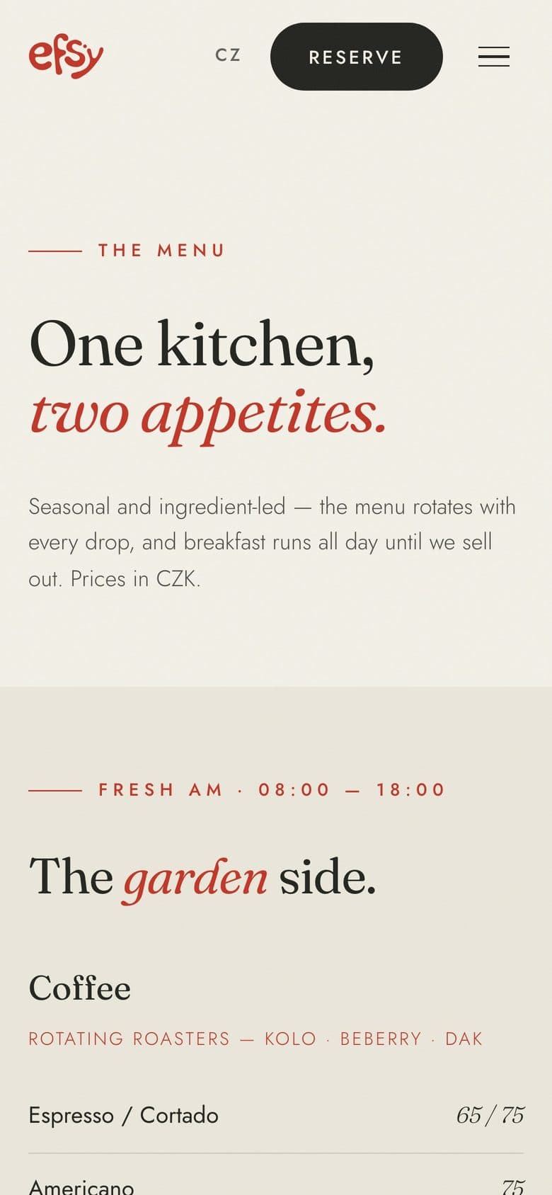
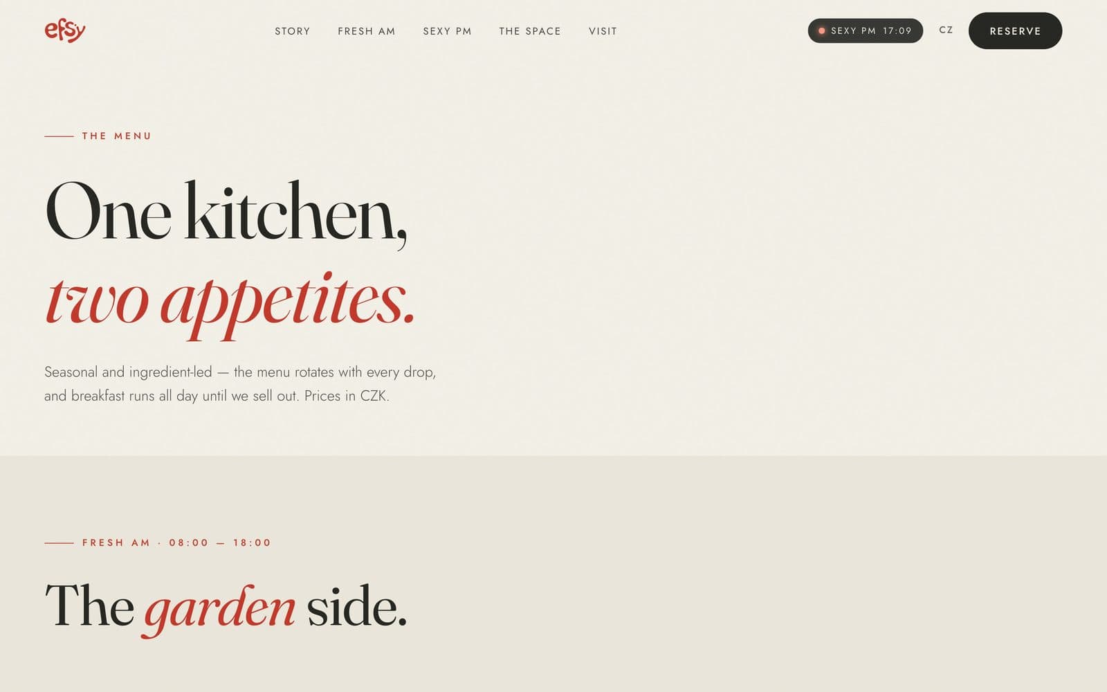
One kitchen, two appetites. Garden side until 18:00, cave side after - same type, same prices, a flip from cream paper to burgundy.
Printed as cards the floor can hand over, not a file that dies in a folder. Hierarchy stays quiet so food, specials, and the cocktail line still read at the table.
Posters
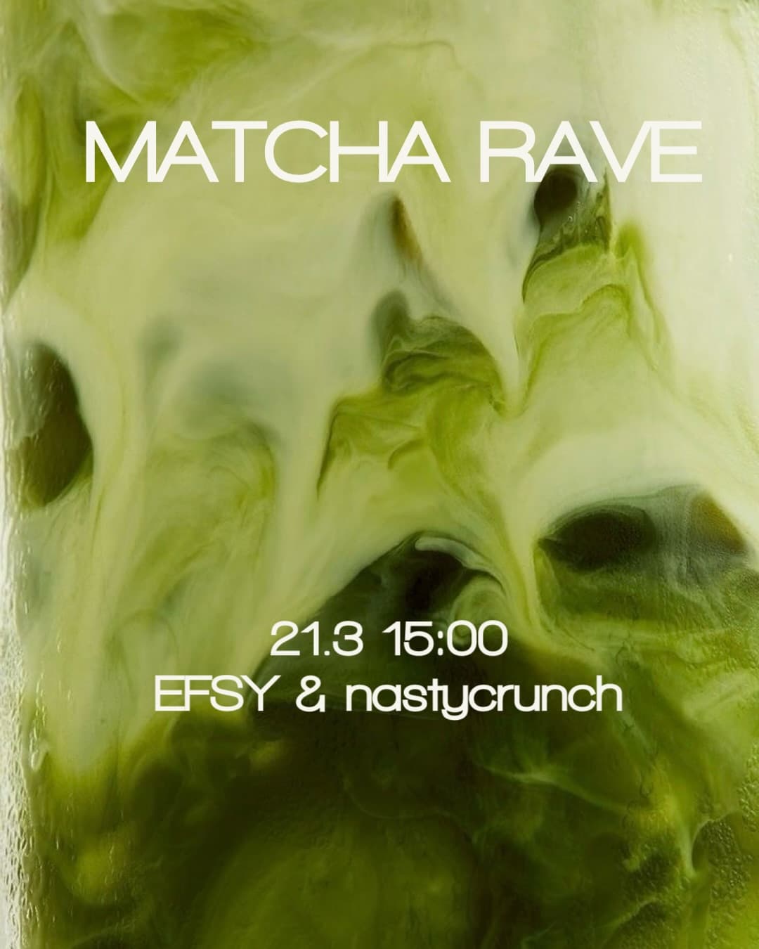
Event and product posters for the feed and the door. Type stays large enough for a story and a print.
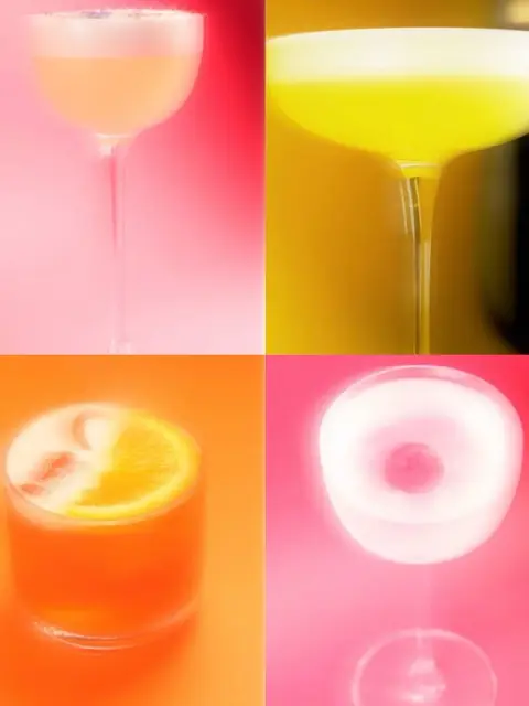
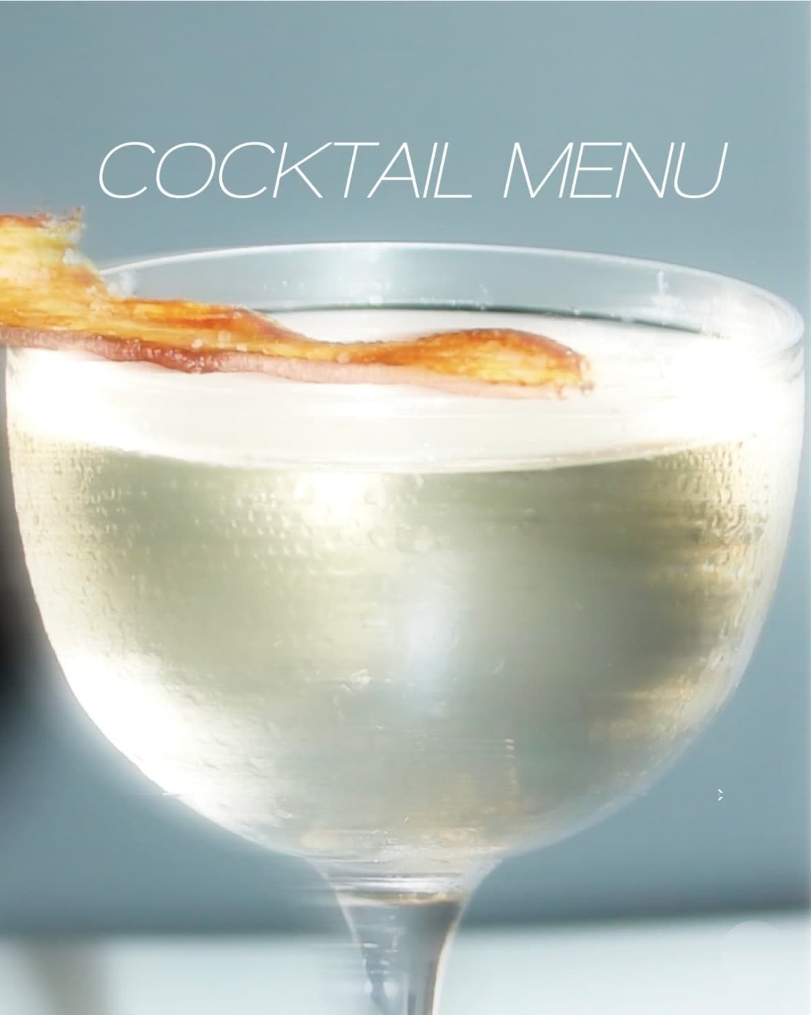
Matcha Rave, the seasonal cocktail menu, and the cocktail grid - one format so the wall and the feed do not drift.
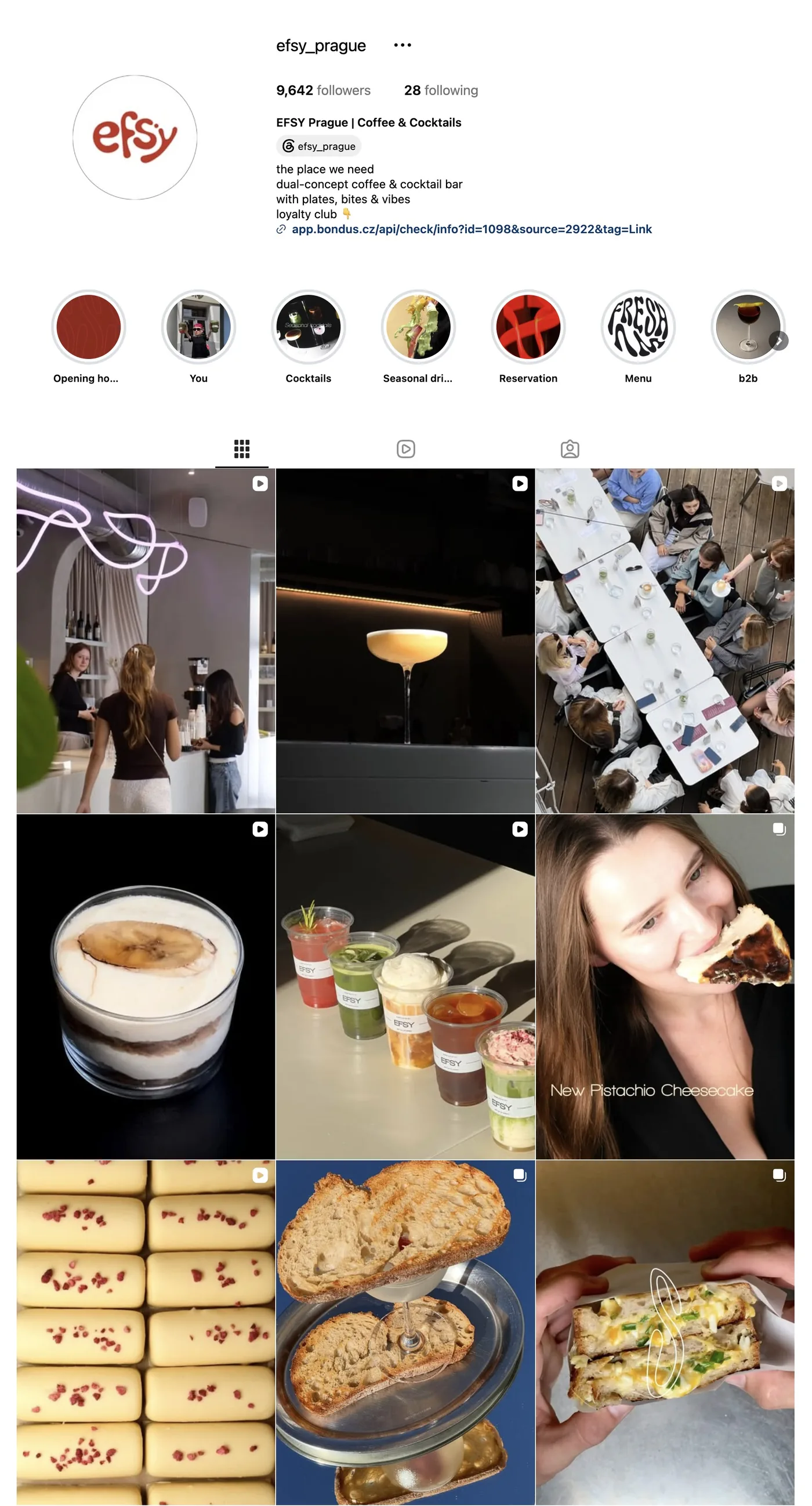
Profile, highlights, and posts for @efsy_prague - opening hours, menu, reservation, and nights. Same wordmark as the cups.
App
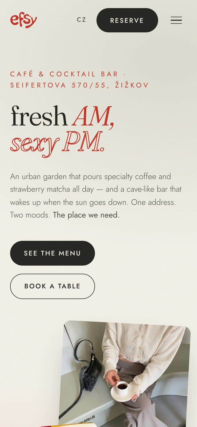
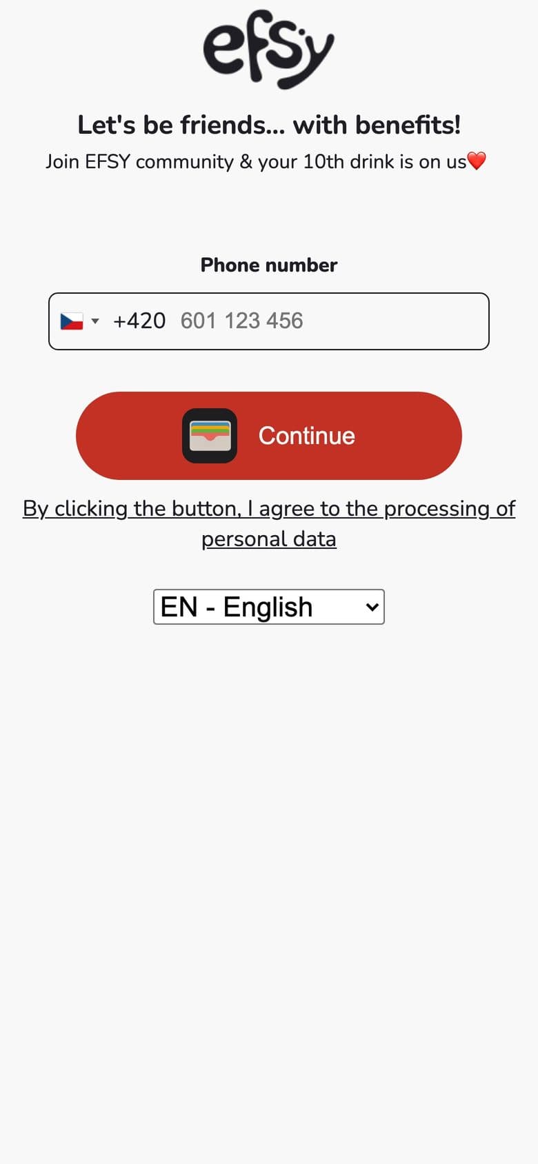
Guest-facing mobile: the site in one hand, a loyalty flow that still looks like Efsy - not a generic wallet skin.
Home, menu, and the 10th-drink join screen share the red mark, cream field, and the same tone of voice as the posters.
Coming Soon
Website
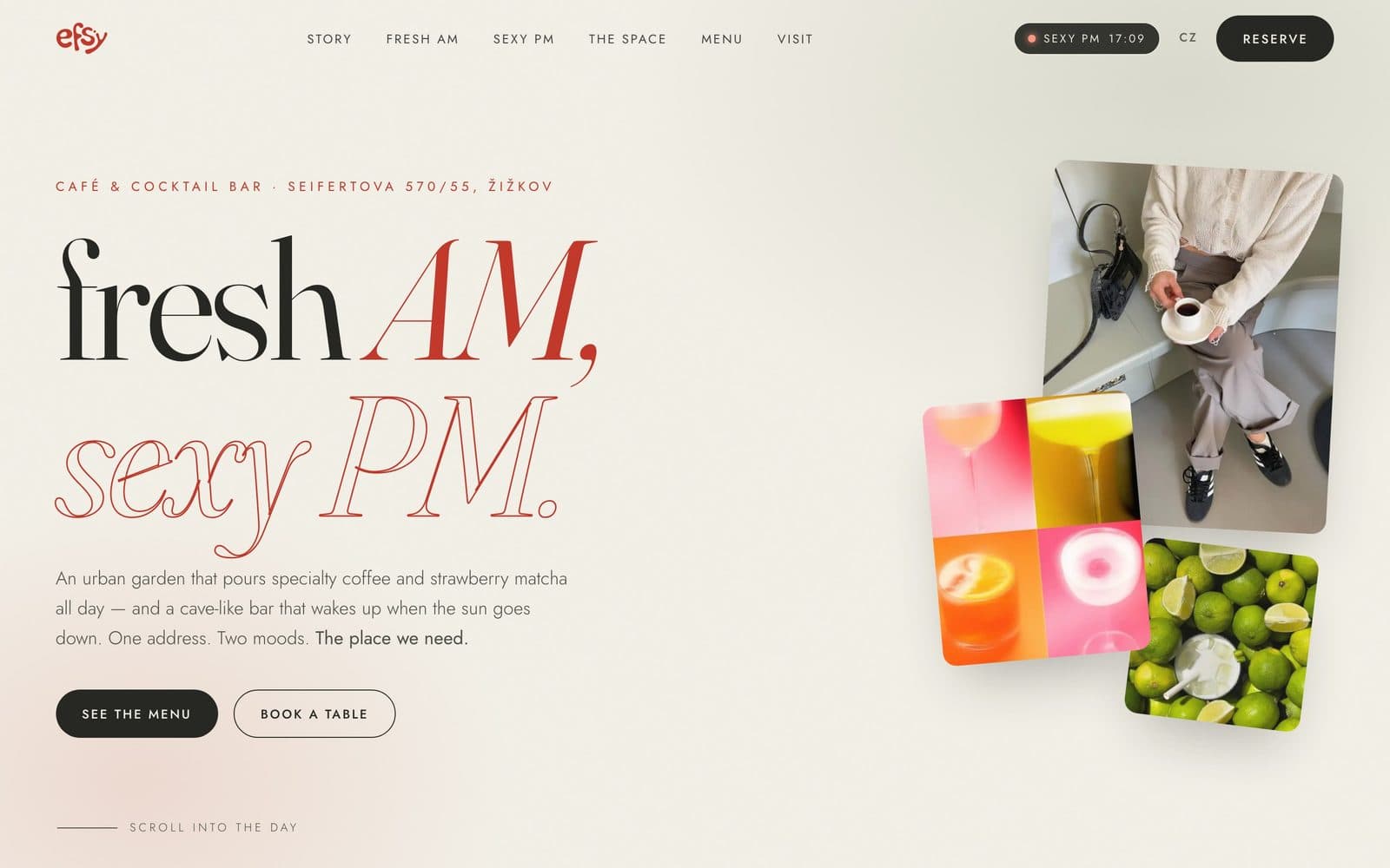
The same Fresh AM / Sexy PM language on a live page - booking, the menu, and the night switch.
The site has to feel like the cups and the printed cards, not a template with a logo pasted on.
Coming Soon